documentation
Analysis Tab: Process
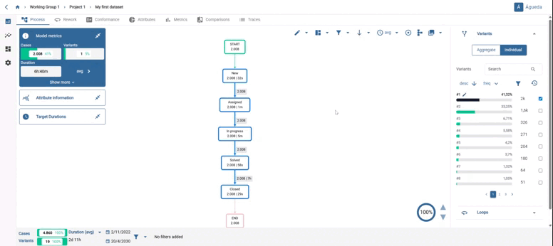
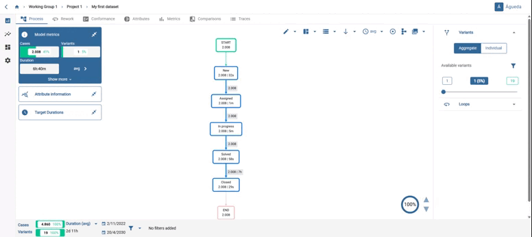
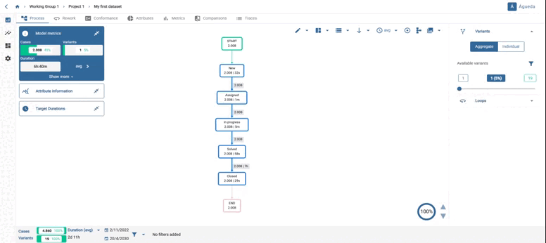
The “Process” tab is composed of four distinct sections.
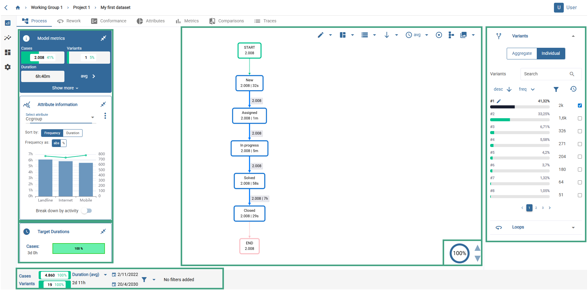
Main screen: graph and top buttons
First of all, the central part shows an interactive graphical representation of the most common variant in our model. The activities are ordered according to their time stamps, giving a sequence of activities.
Each box represents an activity and the accompanying number (2008 in the example) indicates the frequency, i.e. the number of traces where the process follows this sequence of activities. There are 2008 traces that follow the same sequence of activities.
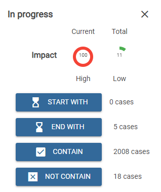
Clicking on an activity in the chart will display a pop-up window associated with that activity, which includes the following elements:
- The name of the activity
- A close window button
- If the activity has a duration, an impact section, which will display: The Wallace™ coefficient value for the activity in the context of the process model displayed on the screen The Wallace™ coefficient value for the activity in the total context of the currently active filtered data set (Total)
- Four buttons that allow you to apply the “Start with”, “End with”, “Contain” and “Do not contain” filters for that activity, as well as the number of cases corresponding to the application of each filter for that activity in the context of the process model displayed on the screen.

Above the graph we have different icons that allow us to change the way in which we visualise the data or the information we want them to give us.
![]() Allows activities to be grouped together or not taken into account in the chart. Selecting Edit displayed activities you can create group activities or remove current activities like shows in the GIF.
Allows activities to be grouped together or not taken into account in the chart. Selecting Edit displayed activities you can create group activities or remove current activities like shows in the GIF.
 Allows you to show, hide or return to their original place the draggable panels on the left.
 If you have added a filter to your data model, this option allows you to choose between displaying the % of total data or the % of filtered data in the model metrics table on the left side of the screen.
 This option allows you to display your graph vertically or horizontally.
 If you want to visualise the durations of your arcs and activities, this option allows you to set time metric between the different options offered: standard deviation, average, median, minimum or maximum.
 This option allows you to center the chart in the screen.
 By clicking on this icon you can convert your displayed model to BPMN.
 You can save the flowchart in an image format (PNG, JPG, SVG)

On the right side of the screen there is a tool that allows you to add variants to your graph by using a slider bar or by clicking on one of the numbers and typing on the keyboard. You notice that, as you add variants, your graph will get bigger and bigger due to the different paths your process can take. Once you select the desired number of variants, you can create a filter that includes all of them to continue our analysis. To do so, just click on the option “Filter displayed variants” and the data will be automatically updated with the new filter created, as shown on the GIF.

When increasing the number of variants, the BPMN graph becomes more complex.
Also on the right side of the screen when clicking on “Individual” we can see how the variants are ordered according to their frequency. For example, the first variant is the one that appears in a greater number of traces (41,32 %), while the second most frequent variant appears in a (33,52%). Each of the variants and their durations can be explored separately by clicking on each of them. In addition, by using the pencil next to the selected variant, we can rename it, making it easier to search for it later.
You can move the activities by clicking on the box and moving to where you want to place it.
On the other hand, if you select an activity or an arc, a panel with information opens:
-Impact: shows the impact coefficient for current trace and for the total traces. This is calculated as follows.
P1= Deviation / average duration
P2 = Volume of the activity / Total volume (in how many traces it appears)
P3 = Duration of activity / total duration of the trace
Impact = P1xP2xP3
-Case count: here you can see, for the trace you are viewing, the number of times it starts with that activity, the number of times it ends with that activity and the number of times the traces contain or do not contain that activity or arc.
When we have a trace that has more than one possible path we can reduce the display of these paths by clicking on the icon in the lower right corner. By selecting on the arrows of this icon we will reduce the different paths in order to see the most frequent paths in a clearer way.
Filtering arcs and activities by frequency
In the lower area, to the right of the graph, we find a circular indicator of the % of activities displayed. By clicking the buttons, we can change the value, which will range from the minimum % of activities that can be displayed to 100%. By changing the value, the activities and arcs that fall within the new threshold of % of the total will be displayed (sorted by frequency).

Bottom bar
The values of the bottom box refer to the variant or set of variants being displayed on the screen, not to the whole model as a whole.

Throughout our analysis, we will have the Analysis context on the left of the screen, composed of metrics such as the number of cases and the number of variants that make up our data set, the duration of the process (which we can configure according to our needs) and the start and end dates of the data, which we can modify to limit the data to a time range of our interest.
When we click on the filter icon, a drop-down menu opens showing different options.
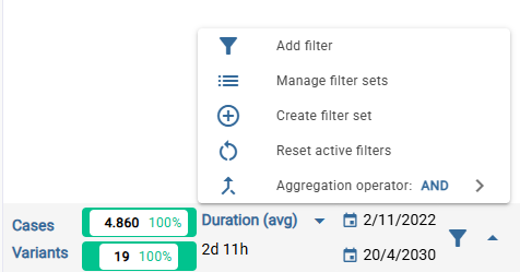
 Opens the filter modal window.
 Opens a modal that allows you to view, apply, or remove filter sets. They can be applied as a set or as individual filters.
 Allows you to create a new filter set using the current filters, choosing an aggregation operator.
 Resets the applied filters.
 Lets you choose between the aggregation operators ‘AND’/’OR’, which will be applied to the current filters.
Variants
If you want to explore more than one variant simultaneously, you can check the box to add as many variants as you want to the process view. If you want to stop viewing a previously added variant, you can uncheck it or use the specific button to reset our view, cancelling all the added variants. In cases where we have two or more variants added to the view, the Process metrics data will be the result of the combination of these variants. If you want you can rename variants clicking on the pencil button.
In the variant view it is also possible to view and select the loops of each selected variant, thus displaying them in the process view. To do this, we must find the “loops” section in the right-hand corner of the screen and consult the information provided for the variant we wish to analyse. We will be able to see the loops, the self-loops or verify that our selected variant has no rework with the message “No rework found”.
Left side panels
All panels can be dragged, minimized and hidden completely via the “Move panels icon” at the top of the graph.

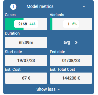
Model metrics
In the model metrics table, we will be able to find interesting information of the analysed model.
- The number of cases that follow this sequence and the % of the total.
- The number of variants we have added to the model display and the % they represent of the total.
- The duration of the displayed trace or, if more than one variant is selected, the average, maximum, minimum or other possibilities between both.
- The date range between the displayed traces.
- Estimated cost and total estimated cost, configurable parameters in the “Settings” tab.
The values of the process metrics refer to the whole filtered model as a whole.
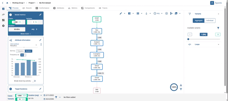
Custom plot panels
In the left margin of the tabs (“Process” and “Reworks”), there is the option to display the information provided by the different attributes and frequencies that make up our dataset.
This option can be collapsed, expanded or moved in the tool view for convenience.
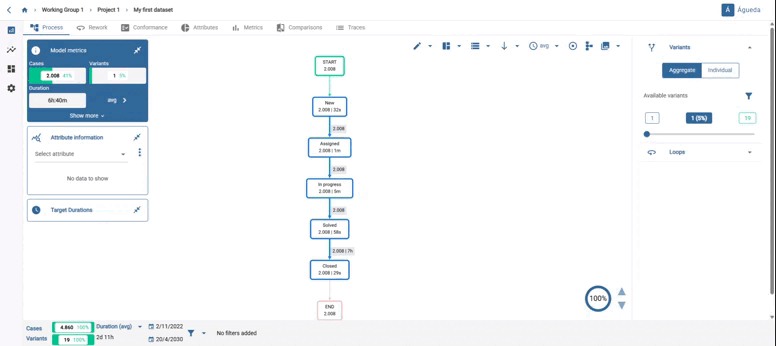
Attribute information.
Using the drop-down list at the top, we can select the attribute we wish to display on the graph and its associated frequencies.
Generally, in the graph, we can make two types of readings. On the one hand, the bars show the frequency of each attribute and its value will be measured on the y-axis to the left of the graph. On the other hand, the value of the average duration will be shown by the dotted line and its value should be read on the y-axis to the right of the graph.
If we wish to make a more precise reading of both the frequency and duration of a specific attribute, leaving the cursor over the bar we wish to consult, we will be able to observe its frequency and duration values.
We can also sort the attributes from left to right according to the frequency and duration we are interested in seeing. This is possible by selecting our preference in the highlighted choice.
Finally, the tool allows you to calculate this information not only at the trace level but also at the activity level. By clicking on the “Break down by activity” button, we can select the activity or activities that should contain the attribute.
However, it is sometimes possible to find numerical attributes as well, which changes the appearance of the panel. In order to correctly display the numerical attribute information associated with the traces that are being represented in the visualized process model, we find a line graph with the historical evolution of the attribute values. The values shown can be filtered by month, week and day (as an average) through a selector. Below, we find a statistical summary that shows the mean, deviation, minimum and maximum of the attribute for the traces represented in the visualized model.
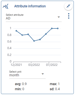
You will see a slider, with the minimum and maximum values of the attribute. On the bottom of the box, the main statistic values of the numeric attributes (average, maximum, minimum and standard deviation). You can slide in order to change those values. When you do so, the graph will automatically update, along with the statistic values down (average, maximum, minimum and standard deviation).
.gif)
Frequency and duration
You can display a time vs frequency graph on the screen. You can select the time unit (”days”, “weeks” or “months”) and the time range ( “start” or “end”).
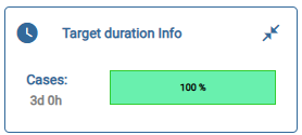
Target duration.
Shows the compliance or non-compliance with the target duration of the displayed trace or of a specific activity or arc.