documentation
Analysis Tab: Metrics
In the process metrics tab, you can view a series of graphs divides into 3 categories: Variants, activities and transitions. These categories will be explained in the following sections.
Below you will also find a short tutorial on how to export the data for viewing in powerBI. Inverbis allows you to download a .pbix file with a predefined dashboard that has already been created for analysing the results.
Variants
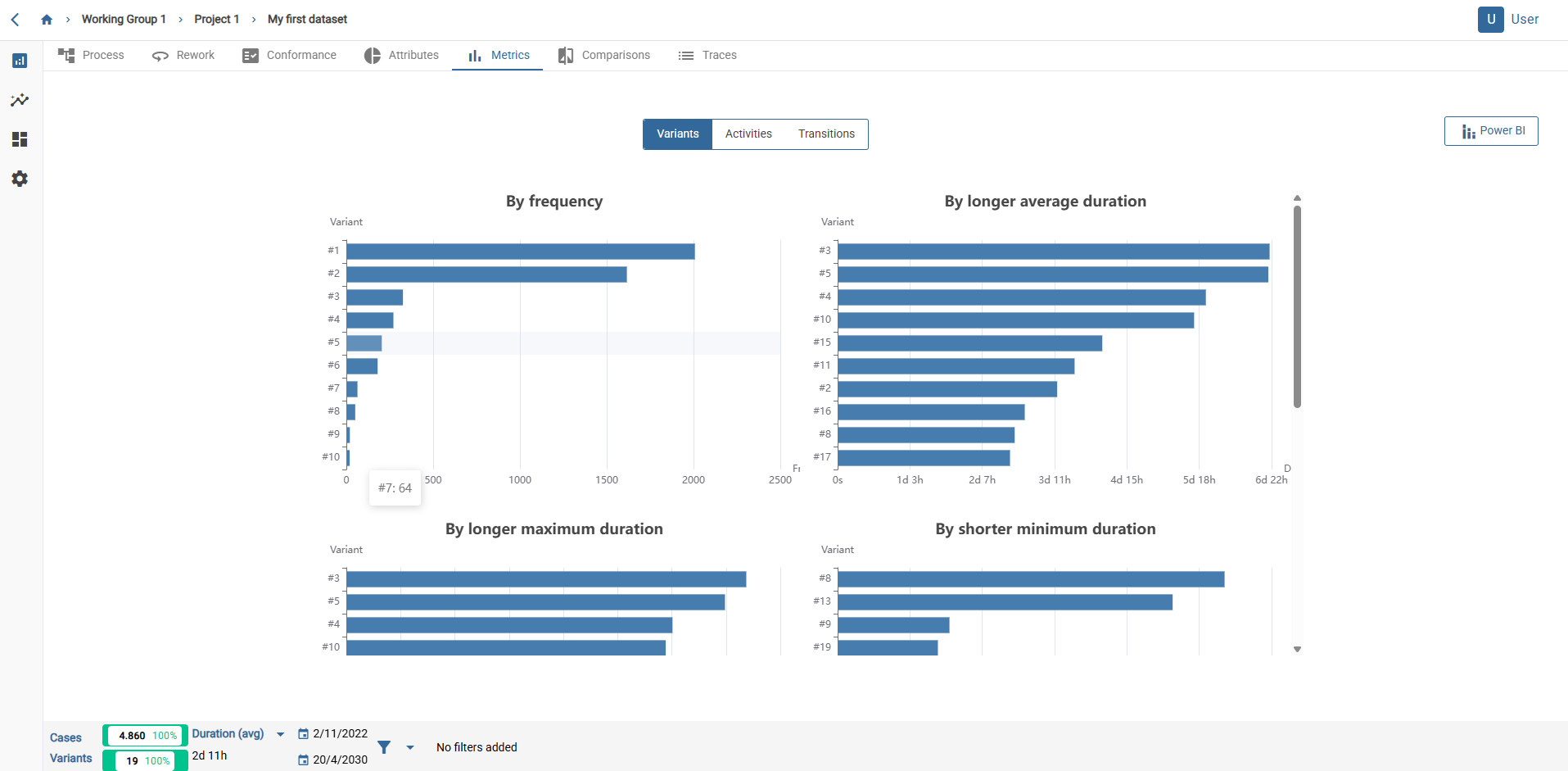
In the variants sub-tab you will find:
- The 10 variants that appear most often (top left).
- The 10 variants with the longest average duration (top right).
- The 10 variants with the longest maximum duration (bottom left).
- The 10 variants with the shortest minimum duration (bottom right).
Further down, there are also:
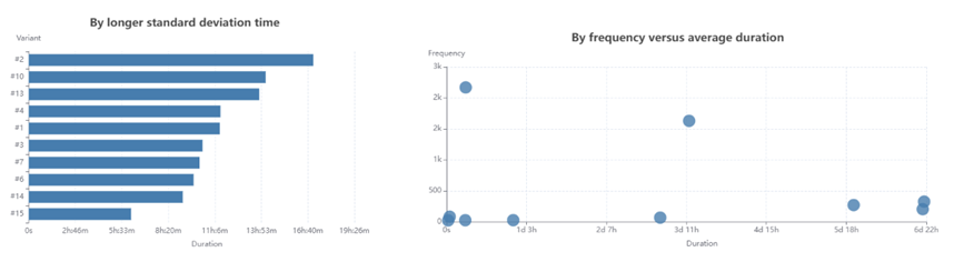
- Graph of variants ordered according to their deviation.
- Correlation graph between frequency and average duration of the different variants.
By placing the cursor over each point you can see more details about the data.
Activities
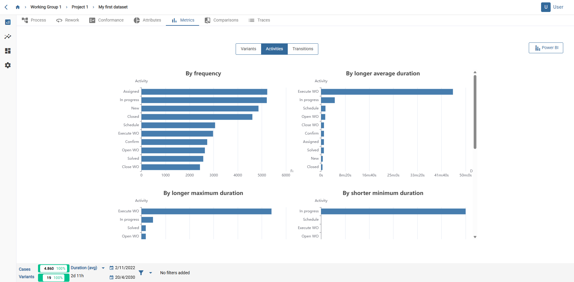
In the activity metrics there are the following graphs:
- Activities ordered by their frequency of appearance (first row, left).
- Activities ordered by their average duration (first row, right).
- Activities ordered by maximum duration (second row, left).
- Activities ordered by their minimum duration (second row, on the right).
- Activities ordered by their deviation (third row).
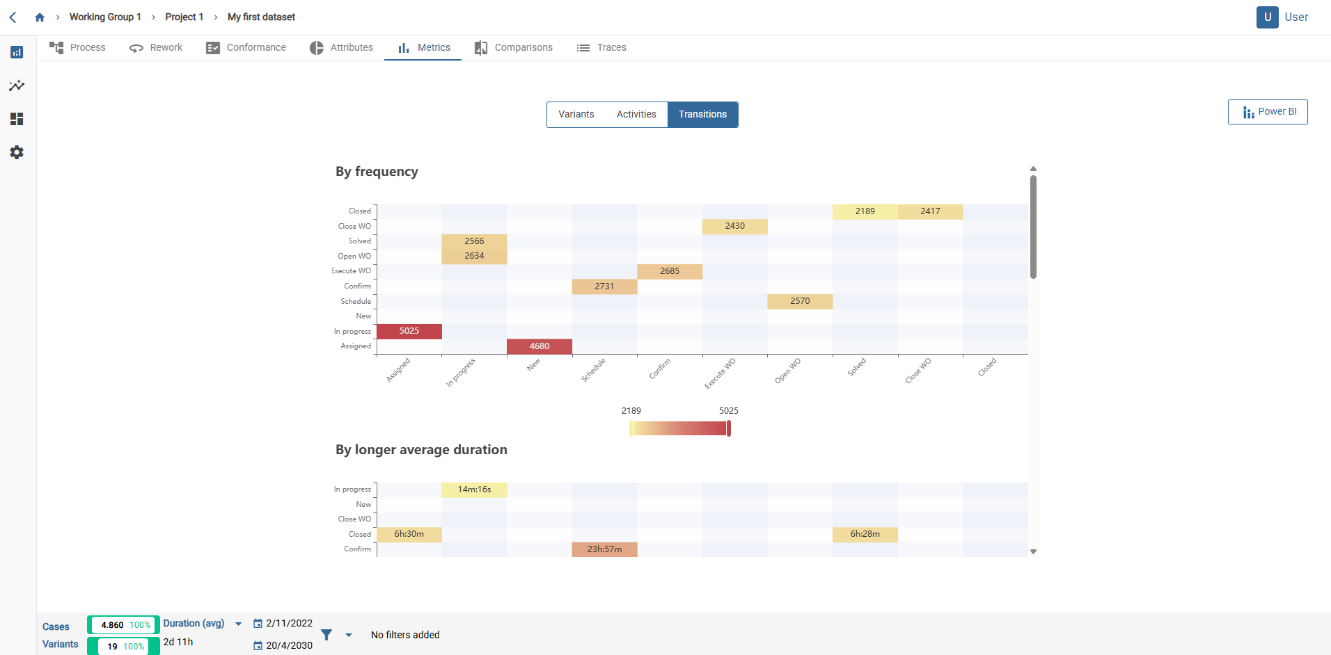
Transitions
In the transition metrics there are several graphs similar to the one in the image, where reference is made to arc, times and frequencies. The activities beginning the arc are represented on the X axis, and those that conclude it are represented on the Y axis.
This type of graph allows you to show different metrics of the arcs, such as:
- Frequency of occurrence.
- Longer average duration.
- Longer maximum duration.
- Shorter minimum duration.
- Greater deviation from its duration.
Export data
These can be exported together in CSV format by clicking on the “Export metrics” button from any of the three tabs.
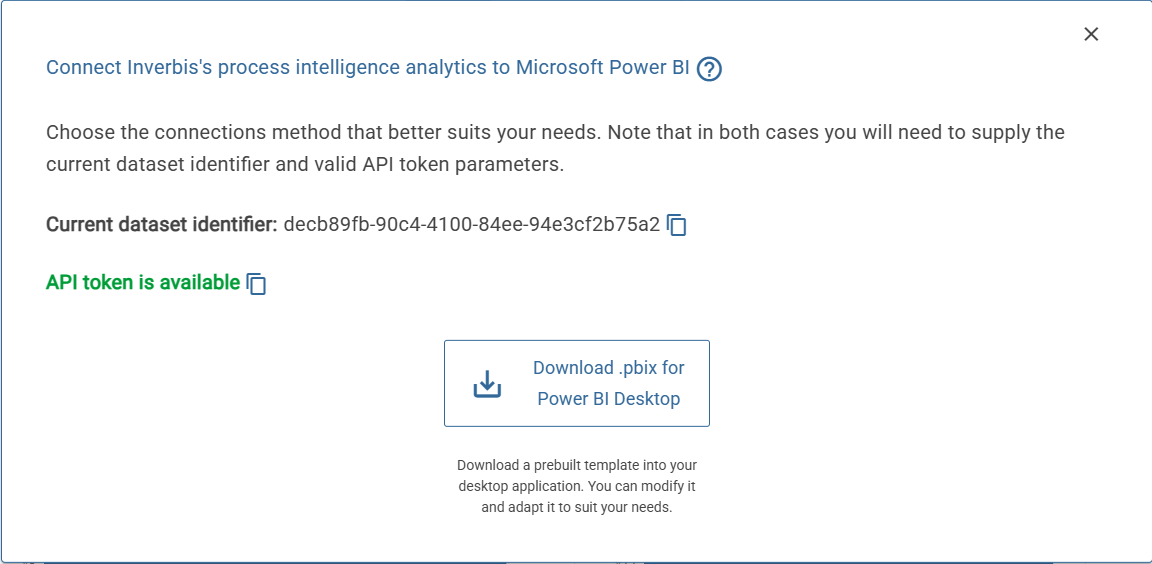
You can also export the metrics on a .pbix format, in order to check them in Power Bi.
You must press the “power BI” button on the left. Then, a new window will appear with the next information: “current data set identifier” and “API token is available”. You must copy both identifiers.
🚨 If you do not have a generated token, you can generate a new one from your profile page. You can acces it through the link given on the window.
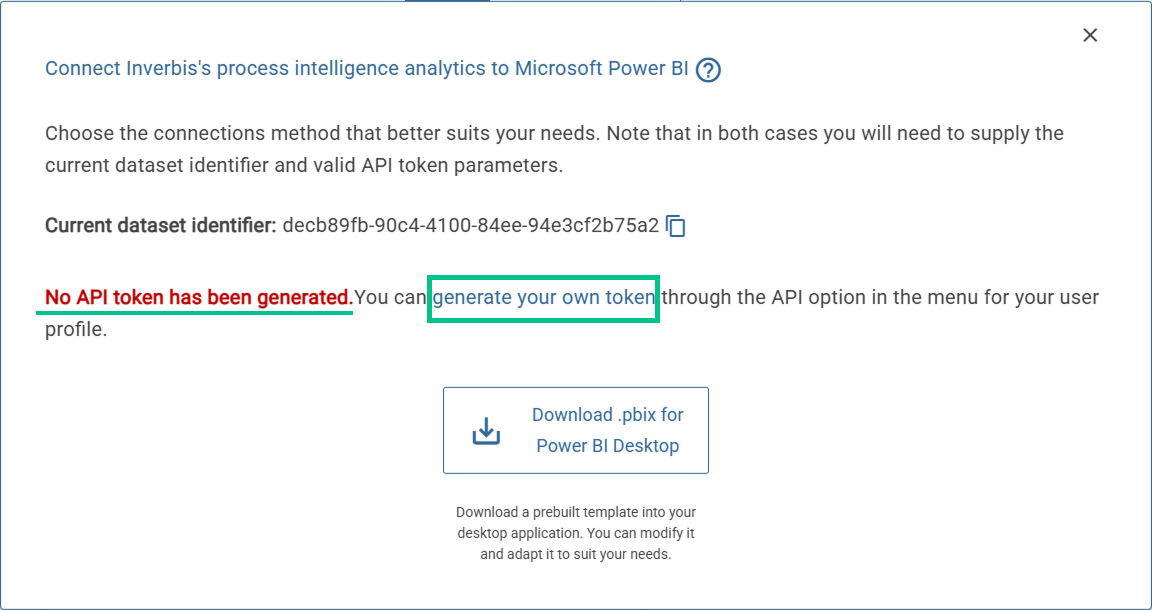
You must press the “Download .pbix Power BI Deskpot” in order to download a prebuilt template into your desktopapplication. You can modify it and adapt it to suit your needs.
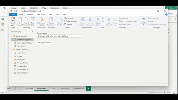
Once we have opened the .pbix file we have downloaded in the power BI desktop application, we must go to any of the tables on the right side of the screen and right-click. A list of actions that we can perform will open and we must select “Edit query”. This will open the power query, where we have all the queries to call the data sets.
Within the power query we have to configure the parameters. First of all, we must enter the UID dataset that we will copy from the pop-up window in Inverbis seen previously. Next, we must copy and paste the token, which we can also copy from the same pop-up window (except in cases where it has not been previously generated). Finally, we must configure the SLA we want, taking into account that the default units are hours.
Once all modifications have been made, close and apply. After a short wait, the dashboard will be generated.
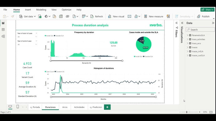
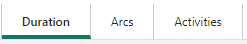
The dashboard that we will have generated will be composed of 3 tabs: Duration, arcs and activities. All the graphs that appear in them are interactive and you can play with them depending on the information you want to extract from your analysis.
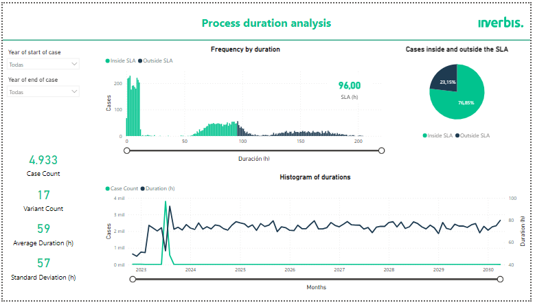
Process duration analysis
In the first tab, we can see the data relating to the analysis of the duration of the process. This screen is composed of 3 graphs: Frequency according to duration, histogram of durations and cases inside and outside the SLA.
In addition, there are drop-down lists in which you can select the start or end year of the data to be analysed.
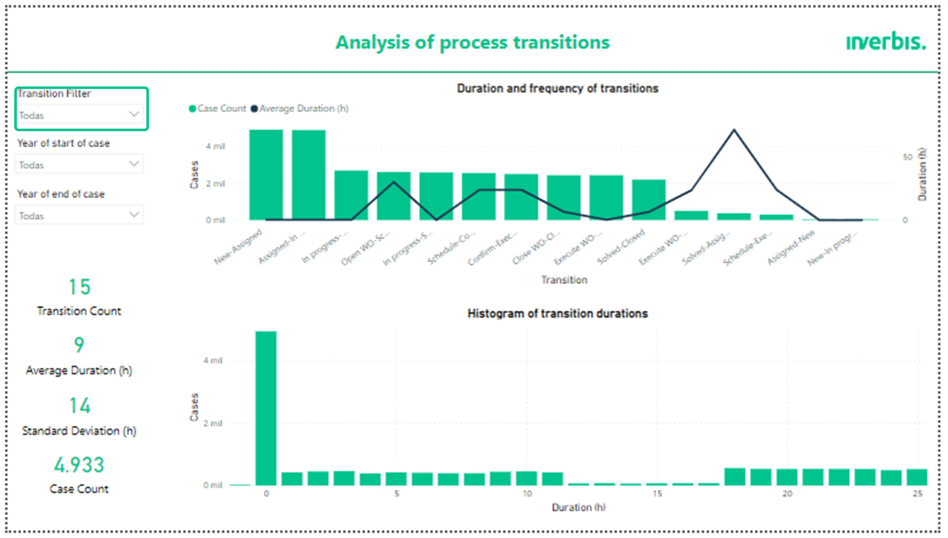
Analysis of process transitions
The second tab allows you to analyse the transitions of the process. In it, two graphs can be observed: A histogram of the durations of the arcs and a bar graph of the duration and frequency of the transitions.
This tab incorporates a transition filter to be able to observe the graphs and metrics of the transition we want to analyse.
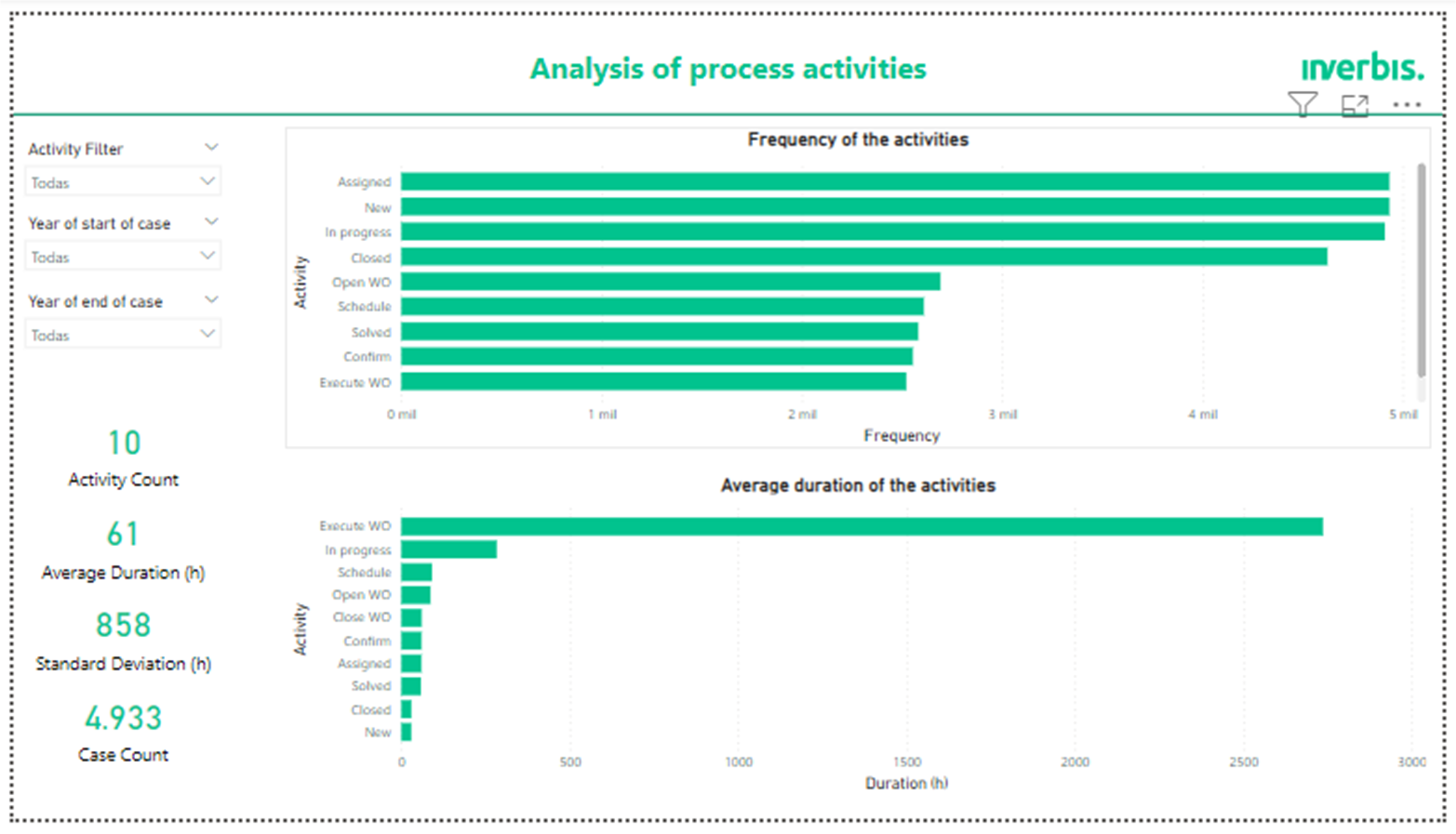
Analysis of process activities
Finally, the tab for the analysis of process activities shows a bar graph referring to the frequency of the activities and another one that shows the average duration in hours of the activities present in the process.